The Map of Doom: A Data-Driven Visualization of the Biggest Threats to Humanity, Ranked from Likely to Unlikely

Surely you’ve learned, as I have, to filter out the constant threats of doom. It’s impossible to function on high alert all of the time. But one must stay at least minimally informed. To check the news even once a day is to encounter headline after headline announcing DOOM IS COMING! Say that we’re all desensitized, and rather than react, we evaluate: In what way will doom arrive? How bad will the doom be? There are many competing theories of doom. Which one is most likely, and how can we understand them in relation to each other?
For this level of analysis, we might turn to Dominic Walliman, physicist and proprietor of Domain of Science, the YouTube channel and website that has brought us entertaining and comprehensive maps of several scientific fields, such as biology, chemistry, mathematics, computer science, and quantum physics. Is ranking apocalypses a scientific field of study, you might wonder? Yes, when it is a data-driven threat assessment. Walliman surveyed and analyzed, as he says in his introduction, “all of the different threats to humanity that exist.”

When the pandemic hit last winter, “we as a society were completely unprepared for it,” despite the fact that experts had been warning us for decades that exactly such a threat was high on the scale of likelihood. Are we focusing on the wrong kinds of doom, to the exclusion of more pressing threats? Instead of panicking when the coronavirus hit, Walliman cooly wondered what else might be lurking around the corner. “Crikey,” says the New Zealander upon the first reveal of his Map of Doom, “there’s quite a lot aren’t there?”
Not content to just collect disasters (and draw them as if they were all happening at the same time), Walliman also wanted to find out which ones pose the biggest threat, “using some real data.” After the Map of Doom comes the Chart of Doom, an XY grid plotting the likelihood and severity of various crises. These include ancient stalwarts like super volcanoes; far more recent threats like nuclear war and catastrophic climate change; cosmic threats like asteroids and collapsing stars; terrestrial threats like widespread societal collapse and extra-terrestrial threats like hostile aliens….
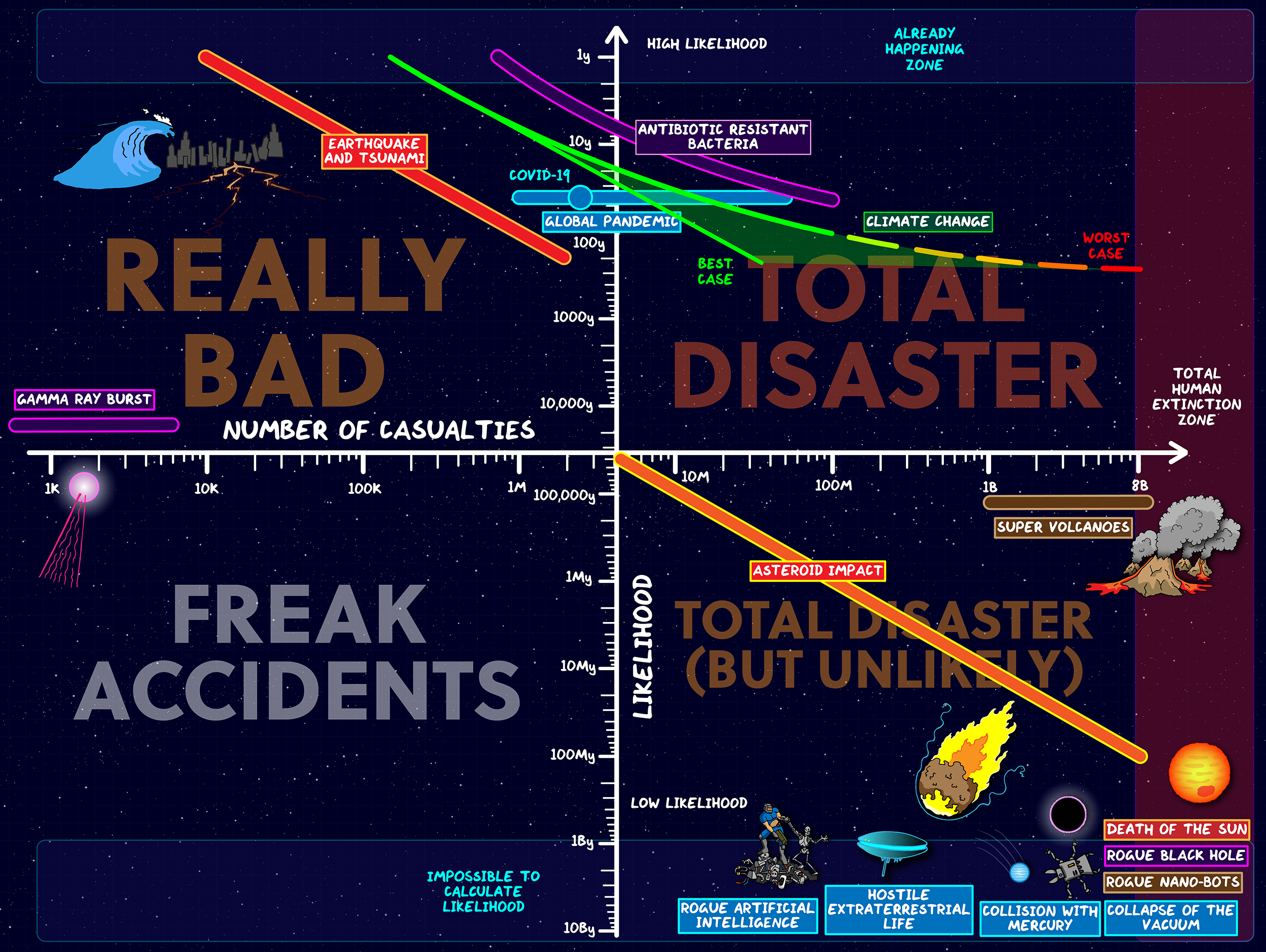
At the top of the graph, at the limit of “high likelihood,” there lies the “already happening zone,” including, of course, COVID-19, climate change, and volatile extreme weather events like hurricanes and tsunamis. At the bottom, in the “impossible to calculate” zone, we find sci-fi events like rogue AI, rogue black holes, rogue nano-bots, hostile aliens, and the collapse of the vacuum of space. All theoretically possible, but in Walliman’s analysis mostly unlikely to occur. As in all of his maps, he cites his sources on the video’s YouTube page.
If you’re not feeling quite up to a data presentation on mass casualty events just now, you can download the Map and Chart of Doom here and peruse them at your leisure. Pick up a Map of Doom for the wall at Walliman’s site, and while you’re there, why not buy an “I survived 2020” sticker. Maybe it’s premature, and maybe in poor taste. And maybe in times of doom we need someone to face the facts of doom squarely, turn them into cartoon infographics of doom, and claim victories like living through another calendar year.
Related Content:
M.I.T. Computer Program Alarmingly Predicts in 1973 That Civilization Will End by 2040
In 1704, Isaac Newton Predicts the World Will End in 2060
Josh Jones is a writer and musician based in Durham, NC. Follow him at @jdmagness
The Map of Doom: A Data-Driven Visualization of the Biggest Threats to Humanity, Ranked from Likely to Unlikely is a post from: Open Culture. Follow us on Facebook, Twitter, and Google Plus, or get our Daily Email. And don't miss our big collections of Free Online Courses, Free Online Movies, Free eBooks, Free Audio Books, Free Foreign Language Lessons, and MOOCs.


from Open Culture https://ift.tt/37Mejkz
via Ilumina
Comments
Post a Comment