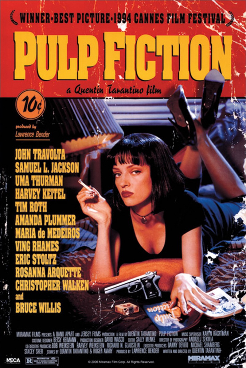
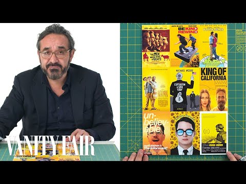
If you can’t judge a movie by its poster, it’s not for the poster designer’s lack of trying. Nearly as venerable as cinema itself, the art of the movie poster has evolved to attract the attention and interest of generation after generation of filmgoers — and, safe to say, developed a few best practices along the way. Some examples go beyond effective advertisement to become icons in and of themselves: take for example, the poster for Quentin Tarantino’s Pulp Fiction, designed by James Verdesoto. In the Vanity Fair video above, Verdesoto draws on a variety of “one-sheets” in order to explain a few of the tricks of the trade.

Like any cultural artifact, movie posters are subject to trend and fashion. It just happens that trends and fashions in movie poster design can last for decades, with each revival bringing an underlying aesthetic concept back into the zeitgeist in a new way. Surely you’ll recall a few years, not long ago, when every major comedy seemed to stamp bold red text on a pure white background: American Pie, the remakes of Cheaper by the Dozen, and The Heartbreak Kid, even the likes of Norbit.
This has been going on at least since the 1980s, as Verdesoto shows by pulling out the poster for John Hughes’ beloved Planes, Trains, and Automobiles, then comparing it to the conceptually similar one for Meet the Parents to note differences in the use of fonts, photographs, and negative space.

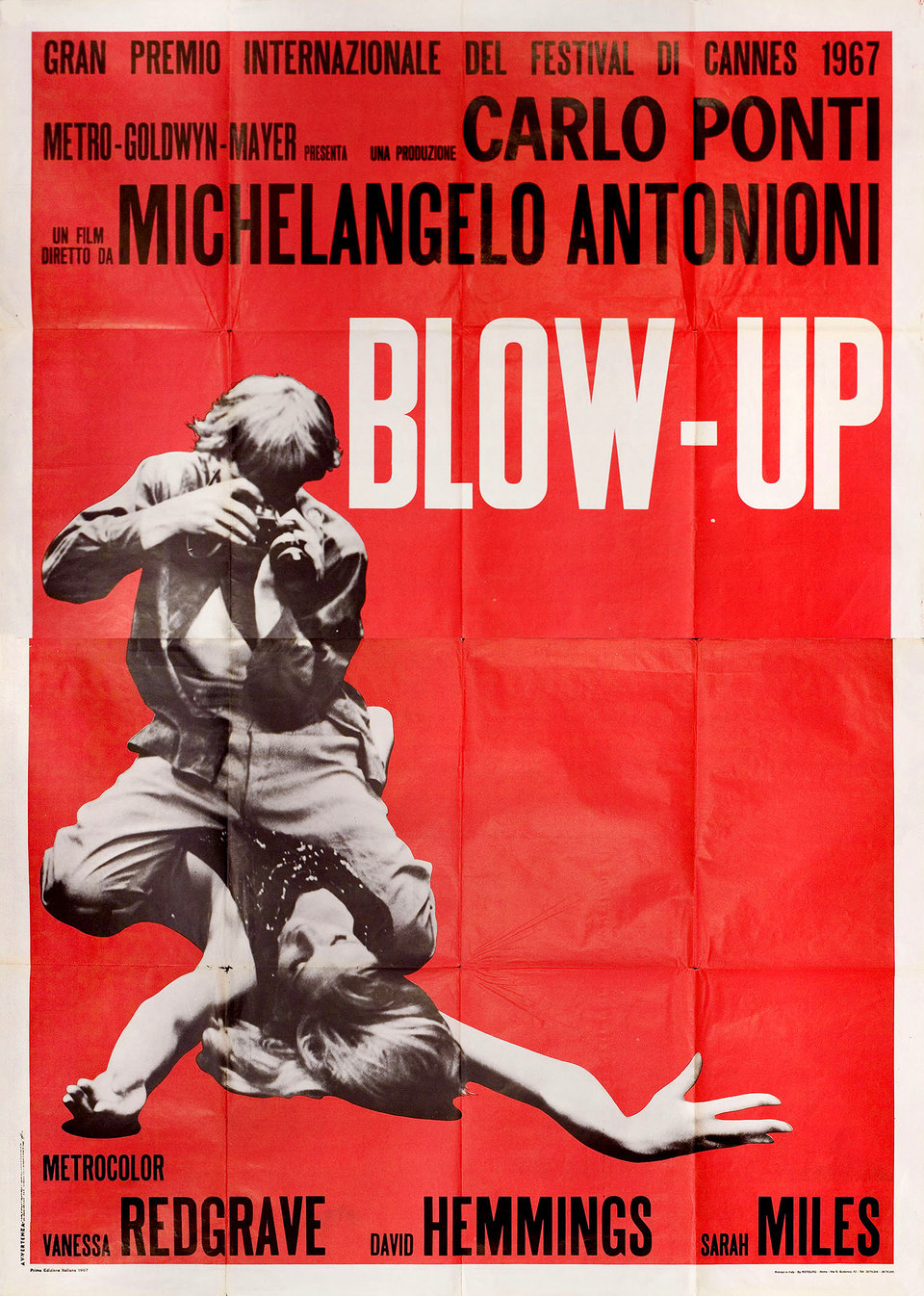
Since The Firm, thrillers have often been signaled with hunted-looking men running down blue-toned corridors or streets, often in silhouette; a great many explosive action movies since Die Hard have gone in for black-and-white posters that emphasize slashes of red or orange. Even the non-genre of “independent films,” often modest of marketing budget, have their own color: canary yellow “a cheap way to catch the eye.” Case in point: Vincent Gallo’s The Brown Bunny, a notorious film that also happened to come with one of the most memorable posters of the 2000s, due not just to its yellow background but because its conscious reference to European designs of the 1950s and 60s, such as the one for Michelangelo Antonioni’s Blow-Up.

You can behold (and in some cases even download) countless many works of movie-poster art, from a variety of decades and a variety of nations, at the sites of the University of Texas Harry Ransom Center and the New York movie poster gallery Posteritati. Here on Open Culture we’ve also featured Taschen’s book of dynamic movie posters of the Russian avant-garde, online archives of the famously artistic movie posters of Poland and Czechoslovakia, not to mention compellingly odd hand-painted movie posters from Ghana. Spend enough time with all of them, and you may find yourself possessed of enough of an intellectual investment in this thoroughly modern art form to start investing in a genuine collection of your own. But no matter your enthusiasm for movie posters, it’ll be a while before you catch up with Martin Scorsese.
Related Content:
50 Film Posters From Poland: From The Empire Strikes Back to Raiders of the Lost Ark
An Archive of 20,000 Movie Posters from Czechoslovakia (1930-1989)
Based in Seoul, Colin Marshall writes and broadcasts on cities, language, and culture. His projects include the Substack newsletter Books on Cities, the book The Stateless City: a Walk through 21st-Century Los Angeles and the video series The City in Cinema. Follow him on Twitter at @colinmarshall, on Facebook, or on Instagram.
The Art of Movie Posters: View Online 40,000+ Movie Posters & Learn How They’re Made is a post from: Open Culture. Follow us on Facebook, Twitter, and Google Plus, or get our Daily Email. And don't miss our big collections of Free Online Courses, Free Online Movies, Free eBooks, Free Audio Books, Free Foreign Language Lessons, and MOOCs.
from Open Culture https://ift.tt/3aa2N5z
via Ilumina

Comments
Post a Comment