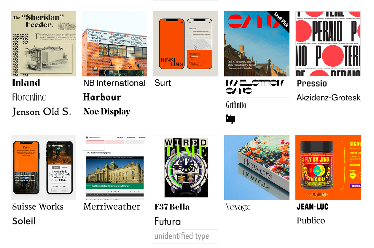
Type selection is an intensive process that requires intimate knowledge of a brand’s values, audience, competition, voice, and goals.
Fonts in Use is a typography nerd’s dream come true.
The 10-year-old independent archive of typography has collected over 17,000 designs, each using at least one of over 12,000 typeface families from more than 3,500 type companies. Each font is contextualized with images depicting them in the wild, on everything from wine labels and storefronts to book covers, record albums, movie posters and of course, advertising of all shapes and sizes.
Fonts can create unlikely bedfellows.

The Ramones‘ iconic seal achieved its presidential look thanks to ITC Tiffany.
Other memorable appearances include the first edition cover of Italo Calvino’s experimental novel If On a Winter’s Night a Traveler and the titles for Hammer Film’s 1980 anthology TV series, Hammer House of Horror.
Fonts in Use’s managing editor, Florian Hardwig, describes ITC Tiffany as “Ed Benguiat’s 1974 revisitation and interpretation of 19th-century faces like West Old Style or Old Style Title,” noting such “Victorian details” as “large angled serifs and sharply terminated diagonals.”
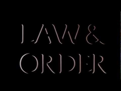
The principal cast of Law & Order underwent several changes over the show’s 20-year run, but Friz Quadrata remained a constant, supplying titles and such necessary details as location, time, and date.
Friz Quadrata should be equally familiar to Dungeons & Dragons players of a certain age and fans of Garden Wafers, the packaged cookies from Hong Kong that are a staple of stateside Asian markets.
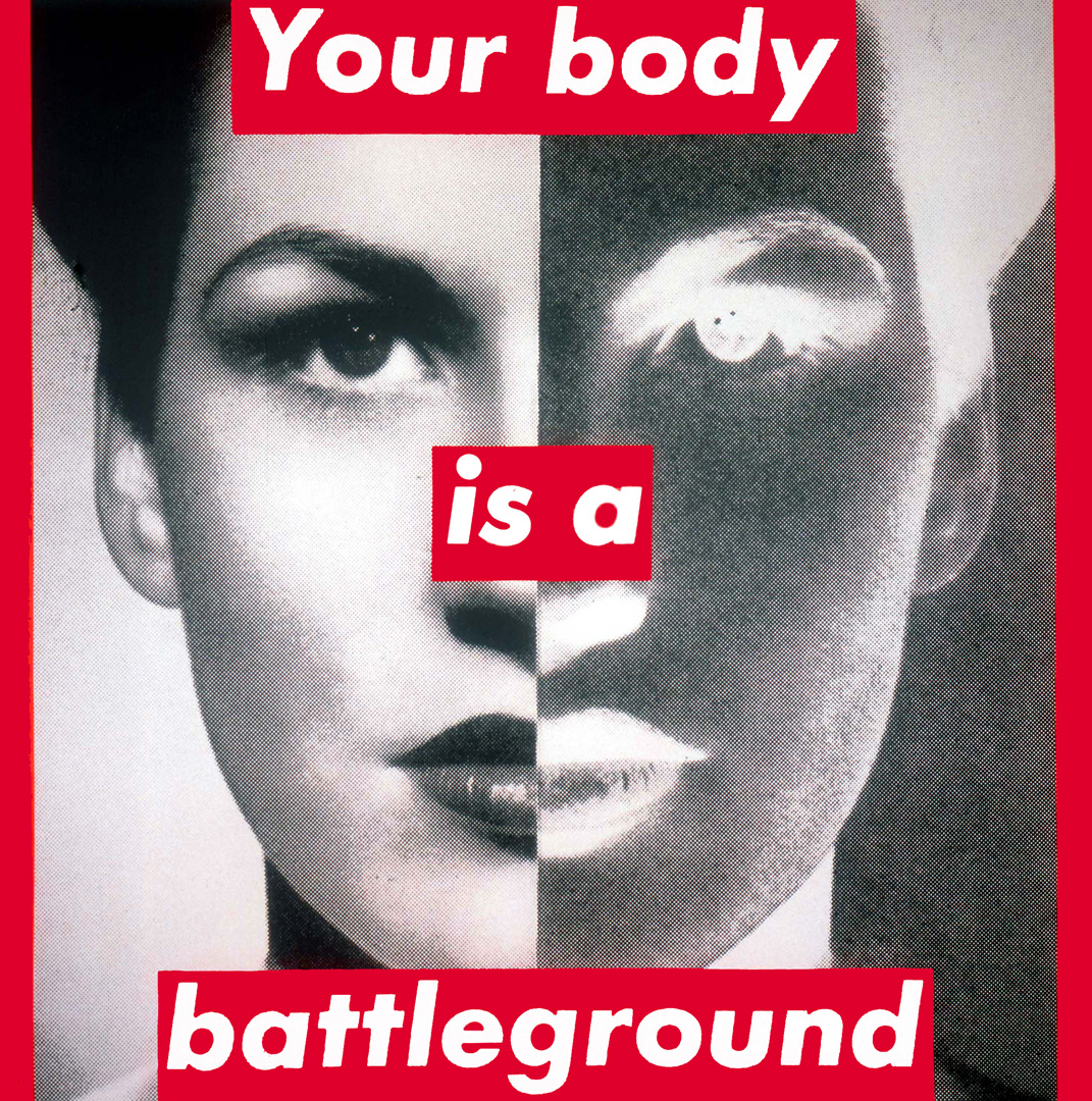
Artist Barbara Kruger‘s distinctive text-based work places overt commentary in white italicized Futura on red bands on top of black and white images.
Futura was also the face of a tourist map to Berlin during the 1936 summer Olympics and author David Rees’ tongue-in-cheek guide How to Sharpen Pencils: A Practical & Theoretical Treatise on the Artisanal Craft of Pencil Sharpening for Writers, Artists, Contractors, Flange Turners, Anglesmiths, & Civil Servants.
Comic Sans may not get much love out in the real world, but it’s well represented in the archive’s user submissions.
You’ll find growing numbers of fonts in Cyrillic, as well as fonts familiar to readers of Chinese, Japanese, Korean, Arabic, Greek and Hebrew…
Newbie Netflix Sans keeps company with 19th-century sans Bureau Grot, a favorite of Vice President-Elect Kamala Harris…
Fat Albert, Tintoretto, Benguiat Caslon, Scorpio, Hoopla and Saphir are your ticket back to a far groovier period in the history of graphic art.
Spend an hour or two rummaging through the collection and we guarantee you’ll feel an urgent need to upload typographic examples pulled from your shelves and cabinets.
Fonts in Use welcomes such submissions, as long as type is clearly visible in your uploaded image and is—or was—in use (as opposed to an example of lettering for lettering’s sake). They will also consider custom typefaces which are historically significant or otherwise outstanding, and those that are available to the general public. Please include a short description in your commentary, and whenever possible, credit any designers, photographers, or sources of your image.
Typography nerds are standing by to help.
Begin your explorations of Fonts in Use here. If you’re feeling overwhelmed, the Staff Picks are a great place to start.
Related Content:
The History of Typography Told in Five Animated Minutes
Why This Font Is Everywhere: How Cooper Black Became Pop Culture’s Favorite Font
Download Hellvetica, a Font that Makes the Elegant Spacing of Helvetica Look as Ugly as Possible
Ayun Halliday is an author, illustrator, theater maker and Chief Primatologist of the East Village Inky zine. She most recently appeared as a French Canadian bear who travels to New York City in search of food and meaning in Greg Kotis’ short film, L’Ourse. Follow her @AyunHalliday.
Fonts in Use: Enter a Giant Archive of Typography, Featuring 12,618 Typefaces is a post from: Open Culture. Follow us on Facebook, Twitter, and Google Plus, or get our Daily Email. And don't miss our big collections of Free Online Courses, Free Online Movies, Free eBooks, Free Audio Books, Free Foreign Language Lessons, and MOOCs.


from Open Culture https://ift.tt/39rNjYL
via Ilumina
Comments
Post a Comment