David Lynch is known for being persnickety about delivering the correct viewing experience to his audience, as he considers the cinema a sacred place. In a documentary short a few years back, he explained, “It’s so magical, I don’t know why, to go into a theater and have the lights go down. It’s very quiet and then the curtains start to open. And then you go into a world.”
However, the cinematheque is also the space where directors have the least control. They can hope that each print that goes out has been printed correctly (especially during the days of film), or that the sound is clear and/or loud enough, but, in a wide release, hope is all directors can do most of the time. There are exceptions: Stanley Kubrick oversaw the rerelease prints of his films. And Alfred Hitchcock demanded that there would be no late seating for Psycho-—a tactic that worked to the film’s advantage.

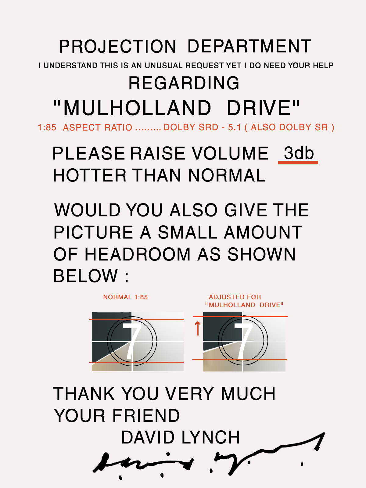
This card (above) from David Lynch came with every print of Mulholland Drive that was sent out to theaters. “I understand this is an unusual request yet I do need your help,” he writes. Lynch asks that the volume be raised 3db and that the image be given a tad more headroom.
John Neff, in a post on the Facebook Lynchland group, explained the card: “The volume request was because when we heard it in the Director’s Guild Theater for the cast and crew screening, David thought it was too quiet. The picture headroom request was because of the original TV aspect ratio. These concerns have been addressed in all format releases since the original DVD release.”
Mulholland Drive was originally shot, or rather, the first half of the film was shot as a television pilot for ABC, so a 16:9 (1.78:1) aspect ratio was expected. But when the studios passed on the pilot, Lynch finished the film as a standalone feature. Cinemas matt projections at 1.85:1, cutting down on the headroom. (None of this effects the original negative, which is standard 35mm.)
Lynch similarly cares about home viewers. The first director-approved box set of his short films came with a similar, Lynch-created calibration video so you could control the color and the white balance. And one of the reasons fans keep waiting for a proper Blu-Ray release of Lost Highway is that Lynch has yet to oversee a proper transfer. When Kino Lorber released theirs in 2019, Lynch took to Twitter to tell fans to skip it: “Dear Twitter Friends, A Blu-ray of LOST HIGHWAY will be released very soon. It was made from old elements and NOT from a restoration of the original negative. I hope that a version from the restoration of the original negative will happen as soon as possible.”
As far as I know, he has not weighed in on the current problems associated with HDTVs, but Tom Cruise has been taking care of that. And whatever you do, do not watch Mulholland Drive on your iPhone.
Related Content:
Watch an Epic, 4-Hour Video Essay on the Making & Mythology of David Lynch’s Twin Peaks
David Lynch Explains How Simple Daily Habits Enhance His Creativity
David Lynch Being a Madman for a Relentless 8 Minutes and 30 Seconds
Ted Mills is a freelance writer on the arts who currently hosts the Notes from the Shed podcast and is the producer of KCRW’s Curious Coast. You can also follow him on Twitter at @tedmills, and/or watch his films here.
David Lynch’s Projection Instructions for Mulholland Drive (2001) is a post from: Open Culture. Follow us on Facebook, Twitter, and Google Plus, or get our Daily Email. And don't miss our big collections of Free Online Courses, Free Online Movies, Free eBooks, Free Audio Books, Free Foreign Language Lessons, and MOOCs.


from Open Culture https://ift.tt/3qgAVBo
via Ilumina
Comments
Post a Comment