The 1855 Map That Revolutionized Disease Prevention & Data Visualization: Discover John Snow’s Broad Street Pump Map
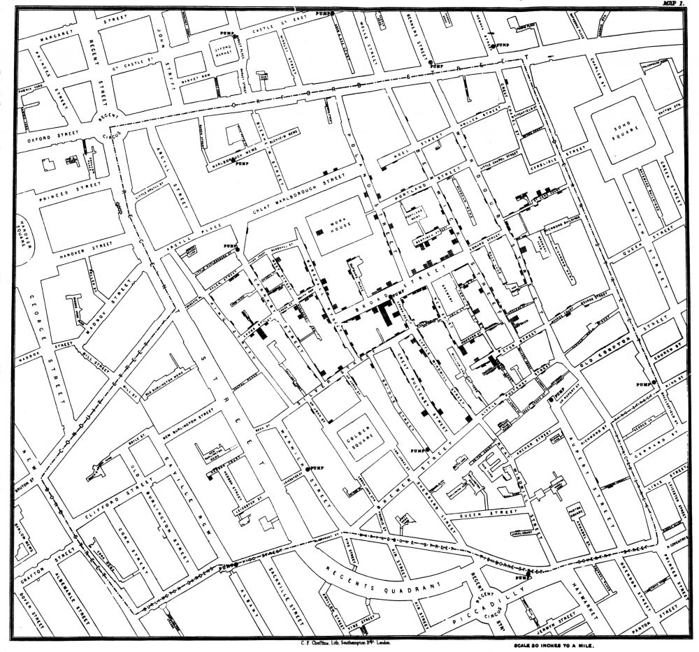
No, he didn’t help defeat an implacable zombie army intent on wiping out all life. But English obstetrician John Snow seems as important as the similarly-named Game of Thrones hero for his role in persuading modern medicine of the germ theory of disease. During the 1854 outbreak of cholera in London, Snow convinced authorities and critics that the disease spread from a contaminated water pump on Broad Street, leading to the now-legendary infographic map above showing the incidences of cholera clustered around the pump.
Snow’s persistence resulted in the removal of the handle from the Broad Street pump and has been credited with ending an epidemic that claimed 500 lives. The Broad Street pump map has become “an enduring feature of the folklore of public health and epidemiology," write the authors of an article published in The Lancet. They also point out that, contrary to popular retellings, the “map did not give rise to the insight” that the pump and its germ-covered handle caused the outbreak. “Rather it tended to confirm theories already held by the various investigators.”
Snow himself published a pamphlet in 1849 called “On the Mode of Communication of Cholera” in which he argued that “cholera is communicated by the evacuations from the alimentary canal.” As he reminded readers of The Edinburgh Medical Journal in an 1856 letter, in that same year, “Dr William Budd published a pamphlet ‘On Malignant Cholera’ in which he expressed views similar to my own.” Germ theory had a long, distinguished history already, and Snow and his contemporaries made sound, evidence-based arguments for it.
But their position “largely went ignored by the medical establishment,” notes Randy Alfred at Wired, “and was opposed by a local water company near one London outbreak.” The accepted, mainstream scientific opinion held that all disease was spread through “miasma,” or bad air. Pollution, it was thought, must be the cause. After the pump handle’s removal, Snow published an 1855 monograph on waterborne diseases. This was the first public appearance of the legendary map—after the removal of the handle.
Helping to inform to Snow’s map, another investigator, parish priest Henry Whitehead had “concluded that it was the washing of soiled diapers into drains which flowed to the communal cesspool that contaminated the pump and started the outbreak,” writes Atlas Obscura. Whitehead, a former critic of germ theory, later pointed out that the removal of the pump handle didn’t actually stop the epidemic, which, he said, “had already run its course” by that point.

Nonetheless, Snow and other proponents of the theory were vindicated, Whitehead had to admit, and Snow's intervention “had probably everything to do with preventing a new outbreak.” The simple, yet sophisticated data visualization would lead to radical new ways of conceptualizing disease outbreaks, helping to stop or prevent who knows how many epidemics before they killed hundreds or thousands. Snow’s map also deserves credit for giving “data journalists a model of how to work today.”
It was hardly the first or only data visualization of cholera outbreaks of the time. "As early as the 1830s," Visual Capitalist points out, "geographers began using spacial analysis to study cholera epidemiology." But Snow's was by far the most influential, and effective, of them all. In his TED talk above, journalist Steven Johnson (author of The Ghost Map:The Story of London's Most Terrifying Epidemic and How It Changed Science, Cities, and the Modern World) tells the story of how the outbreak, and Snow's theory and map, "helped create the world that we live in today, and particularly the kind of city that we live in today."
Read a Q&A with Johnson here; head over to The Guardian's Data Blog to see Snow's visualization recreated over a modern, satellite-view map of London and the Soho neighborhood of the famous Broad Street pump; and learn more about Snow and deadly cholera outbreaks in the crowded European cities of the early 19th century at the John Snow Archive and Research Companion online.
Related Content:
Florence Nightingale Saved Lives by Creating Revolutionary Visualizations of Statistics (1855)
The Art of Data Visualization: How to Tell Complex Stories Through Smart Design
Josh Jones is a writer and musician based in Durham, NC. Follow him at @jdmagness
The 1855 Map That Revolutionized Disease Prevention & Data Visualization: Discover John Snow’s Broad Street Pump Map is a post from: Open Culture. Follow us on Facebook, Twitter, and Google Plus, or get our Daily Email. And don't miss our big collections of Free Online Courses, Free Online Movies, Free eBooks, Free Audio Books, Free Foreign Language Lessons, and MOOCs.


from Open Culture https://ift.tt/2jITIZE
via Ilumina
Comments
Post a Comment