Napoleon’s Disastrous Invasion of Russia Detailed in an 1869 Data Visualization: It’s Been Called “the Best Statistical Graphic Ever Drawn”
It’s tempting to associate data visualizations with PowerPoint and online graphics, which have enabled an unheard-of capacity for disseminating full-color images. But the form reaches much further back in history. Further back, even, than the front pages of USA Today and glossy sidebars of Time and
Newsweek. In 1900, for example, W.E.B. Du Bois made impressive use of several full-color data visualizations for the First Pan-African Conference in London, with no access whatsoever to desktop publishing software or a laser printer.
Almost fifty years before Du Bois turned statistics into swirls of color and shape, Florence Nightingale used her little-known graphic design skills to illustrate the causes of disease in the Crimean War and John Snow (not Jon Snow) illustrated his revolutionary Broad Street Pump cholera theory with a famous infographic street map.
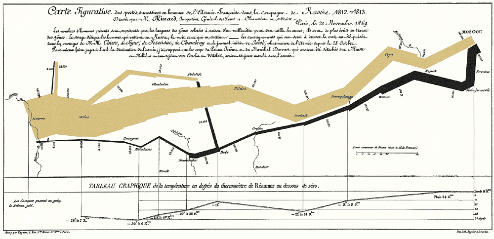
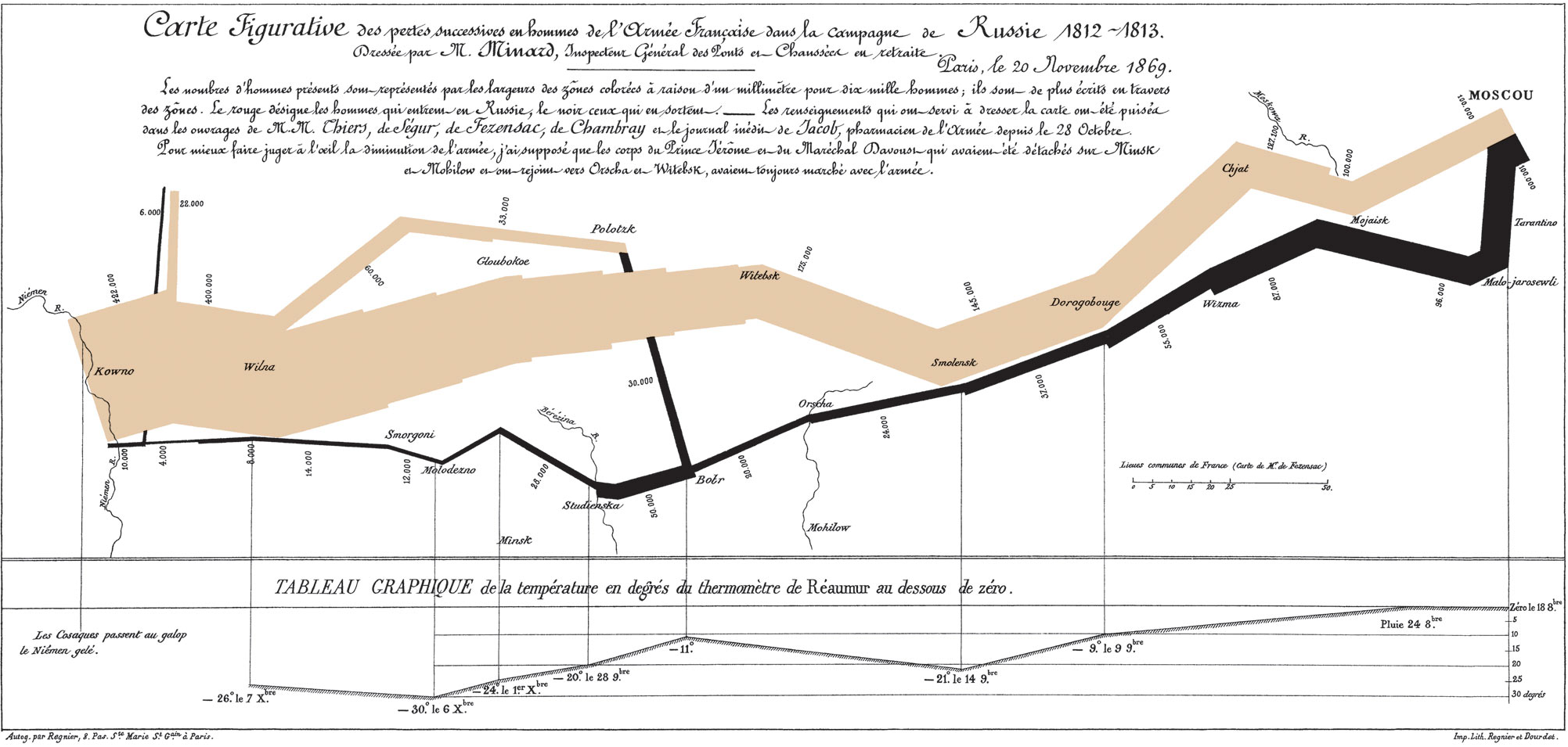
Around this same time, another data visualization pioneer, Charles Joseph Minard, produced some of the most highly-regarded infographics ever made, including the 1869 illustration above of Napoleon’s march to, and retreat from, Moscow in the War of 1812. View it in a large format here.
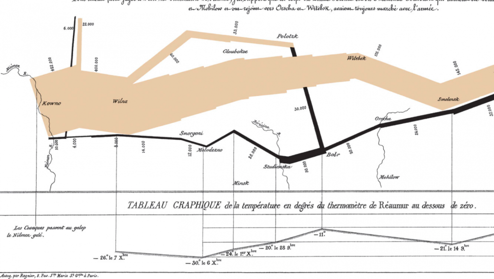
Made fifty years after the event, when Minard was 80 years old, the map has been called by the bible of data visualization studies—Edward Tufte’s The Visual Display of Quantitative Information—“probably the best statistical graphic ever drawn.” Over at thoughtbot.com, Joanne Cheng sums up the context, if you needed a historical refresher: “The year is 1812 and Napoleon is doing pretty well for himself. He has most of Europe under his control, except for the UK.”
Angered by Czar Alexander’s refusal to support a UK trade embargo to weaken their defenses, Napoleon “gathers a massive army of over 400,000 to attack Russia.” The campaign was disastrous: overconfident advances on Moscow turned into devastating wintertime retreats during which the Grande Armée only “narrowly escaped complete annihilation.” So, how does Minard’s 1869 Tableau Graphique tell this grand story of hubris and icy carnage? And, Cheng asks, “what makes it so good?”
Cheng breaks Minard’s series of jagged lines and shapes down into more conventional XY axis line graphs to show how he coordinated a huge amount of information, including the locations (by longitude) of different groups of Napoleon’s troops at different points in time, their direction, and the precipitously falling temperatures in the stages of retreat. He drew from a list of the best historical sources he could consult at the time, turning dense prose into the spare, clean lines that set data scientists’ hearts a-flutter.
Minard began his career in a much more recognizably 19-century design field, building bridges, dams, and canals across Europe for the first few decades of the 1800s. As a civil engineer “he had the good fortune to take part in almost all the great questions of public works which ushered in our century,” noted an obituary published in Annals of Bridges and Roads the year after Minard’s death in 1870. “And during the twenty years of retirement, always au courant of the technical and economic sciences, he endeavored to popularize the most salient results.”
He did so by venturing outside the subject of engineering, while using the “innovative techniques he had invented for the purpose of displaying flows of people” on paper, writes Michael Sandberg at DataViz. In order to tell the tragic tale” of Napoleon’s crushing defeat “in a single image,” Minard imagined the event as a dynamic physical structure.
Minard’s chart shows six types of information: geography, time, temperature, the course and direction of the army’s movement, and the number of troops remaining. The widths of the gold (outward) and black (returning) paths represent the size of the force, one millimetre to 10,000 men. Geographical features and major battles are marked and named, and plummeting temperatures on the return journey are shown along the bottom.
This was hardly Minard’s first infographic. In fact, he made “scores of other graphics and charts,” National Geographic writes, “as well as nearly 50 maps. He pioneered several important thematic mapping techniques and perfected others, such as using flow lines on a map.” (See other examples of his work at National Geographic’s site.) Minard may not be much remembered for his infrastructure, but his ability, as his obituarist wrote, to turn “the dry and complicated columns of statistical data” into “images mathematically proportioned” has made him a legend in data science history circles.
Again, view Minard's visualization of Napoleon's failed invasion in a large format here.
Related Content:
Florence Nightingale Saved Lives by Creating Revolutionary Visualizations of Statistics (1855)
Josh Jones is a writer and musician based in Durham, NC. Follow him at @jdmagness
Napoleon’s Disastrous Invasion of Russia Detailed in an 1869 Data Visualization: It’s Been Called “the Best Statistical Graphic Ever Drawn” is a post from: Open Culture. Follow us on Facebook, Twitter, and Google Plus, or get our Daily Email. And don't miss our big collections of Free Online Courses, Free Online Movies, Free eBooks, Free Audio Books, Free Foreign Language Lessons, and MOOCs.


from Open Culture https://ift.tt/2NKHbCZ
via Ilumina
Comments
Post a Comment