The idea that the world maps are wrong — all of them — is hardly controversial. It’s a mathematical fact that turning a globe (or an oblate spheroid) into a two-dimensional object will result in unavoidable distortions. In the TED-Ed lesson above by Kayla Wolf, you’ll learn a brief history of world maps, starting all the way back with the Greek mathematician Ptolemy, who “systematically mapped the Earth on a grid” in 150 AD in order to create maps that had a consistent scale. His grid system is still in use today — 180 lines of latitude and 360 lines of longitude.
Most of the world maps we knew come from the Mercator Projection, “a cylindrical map projection presented by the Flemish geographer and cartographer Gerardus Mercator in 1569,” writes Steven J. Fletcher.
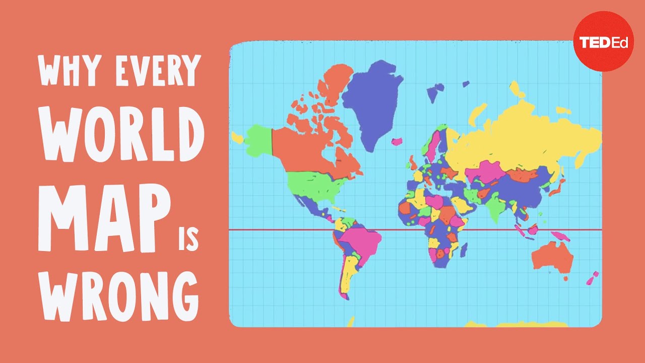
This map projection is practical for nautical applications due to its ability to represent lines of constant course, known as rhumb lines, as straight segments that conserve the angles with the meridians…. the Mercator projection distorts the size of objects as the latitude increases from the equator to the poles, where the scale becomes infinite.
Mercator’s innovation allowed for the shipping routes that created the modern world (including those through the now-unblocked Suez Canal). But the projection has its problems: 14 Greenlands, for example, could fit inside the continent of Africa, says Wolf, but “you wouldn’t guess it from most maps of the world” in which the two land masses are almost the same size.
“In 2010,” Adam Taylor notes at The Washington Post, “graphic artist Kai Krause made a map to illustrate just how big the African continent is. He found that he was able to fit the United States, India and much of Europe inside the outline of the African continent.”
Geographical misperceptions “shape our understanding of the world,” Nick Routley writes at Business Insider, “and in an increasingly interconnected and global economy, this geographic knowledge is more important than ever.” We are no longer primarily using maps, that is to say, to chart, trade with, or conquer formerly unknown regions of the world — from locations assumed to be the natural centers of commerce, culture, or religion.
Non-Mercator world maps have, over the last few decades especially, attempted to correct the errors of cylindrical projection by unfolding the globe like an orange peel or a series of interlocking triangles, as in Buckminster Fuller’s 1943 Dymaxion Map. These have proved nautical miles more accurate than previous versions but they are useless in navigating the world.
Why create new, more accurate world maps? Because the Mercator projection has given the impression of Euro-American geographical supremacy for almost 500 years now, Wolf’s lesson argues, simply by virtue of the location of its origin and its original purpose. But it is now not only inaccurate and outdated, it is also irrelevant. Maps play a vital role in education. The practical utility, however, of flat world maps is usually beside the point, since GPS technology has mostly eliminated the need for them altogether.
Related Content:
Buckminster Fuller’s Map of the World: The Innovation that Revolutionized Map Design (1943)
Japanese Designers May Have Created the Most Accurate Map of Our World: See the AuthaGraph
Why Making Accurate World Maps Is Mathematically Impossible
Download 67,000 Historic Maps (in High Resolution) from the Wonderful David Rumsey Map Collection
200 Online Certificate & Microcredential Programs from Leading Universities & Companies
Josh Jones is a writer and musician based in Durham, NC. Follow him at @jdmagness
Why Every World Map Is Wrong is a post from: Open Culture. Follow us on Facebook, Twitter, and Google Plus, or get our Daily Email. And don't miss our big collections of Free Online Courses, Free Online Movies, Free eBooks, Free Audio Books, Free Foreign Language Lessons, and MOOCs.


from Open Culture https://ift.tt/2PoKXnl
via Ilumina
Comments
Post a Comment