Hand-Colored Maps of Wealth & Poverty in Victorian London: Explore a New Interactive Edition of Charles Booth’s Historic Work of Social Cartography (1889)
Mapping has always been contentious, no matter where you look in time. Maps preserve ideological assumptions on paper, rationalizing physical space as they render it in two dimensions. No matter how didactic, they can become political weapons. In the case of Charles Booth’s visually impressive Maps Descriptive of London Poverty, we have a series of maps whose own assumptions can sometimes seem at odds with their ostensible purpose: to improve the living conditions of London’s poor.
Booth’s “colourful poverty maps were created between 1886 and 1903,” Zoe Craig writes at Londonist, as part of a “ground-breaking study into the lives of ordinary Londoners.” A philanthropist born into wealth in the shipping trade, Booth took it upon himself to study poverty in London in order to initiate social reforms.
He succeeded. The study, conducted by Booth and a team of researchers, led to the creation of Old Age pensions, which Booth called “limited socialism,” as well as school meals for hungry children. He was clear about that fact that he saw such reforms as a bulwark against socialist revolution.
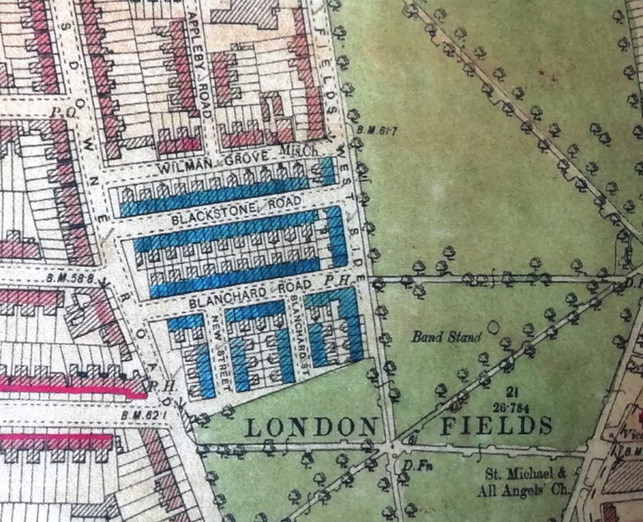
The study’s seventeen volumes are filled with picturesque accounts. “Picking through the tidbits of information from these people’s lives will make you feel a bit like a Victorian costume drama police detective,” Craig remarks. This reference to policing feels pointed, given the role of the police in maintaining class hierarchies in Victorian London. As an American, it can be hard to look at Booth’s map and not also see the 20th redlining practices in U.S. cities. Consider, for example, the categories Booth applied to London’s classes:
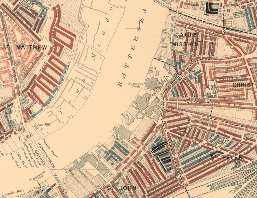
Called 'Inquiry Into the Life and Labour of the People in London', the epic work studied families and residents living across London, and coloured the streets according to their financial situation: between black for 'lowest class, vicious, semi-criminal' through pink for mixed 'some comfortable, some poor' to orange for 'wealthy'.
As in Daniel Patrick Moynihan’s paternalistic 1965 report on the Black underclass in the U.S., the language reinforces Social Darwinist ideas that deem the “lowest class” unfit for full participation in civil society—“vicious, semi-criminal…”
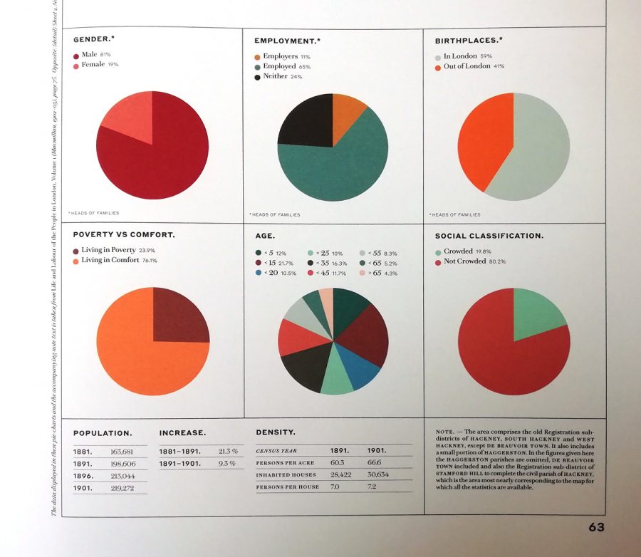
Of course, the social and historical context differs markedly, but we might also consider Feargus O’Sullivan’s observations at Bloomberg CityLab. A new published edition of the map, he writes, “accompanied by compelling if bleak period photos, reveals a city that possesses echoes of London today. It depicts, after all, a densely-packed metropolis with a cosmopolitan population where immensely wealthy people lived just around the corner from neighbors who were struggling to make ends meet.”
Maps may not create the social conditions they describe, but they can help perpetuate them, rendering people visible in ways that allow for even more control over their lives. Criticisms of Booth’s study claimed that not only did the proposed reforms not go far enough but that the report described London’s class structure while offering little to no analysis of the causes of poverty. In language that sounded less objectionable to Victorian ears, the poor are mostly blamed for their own condition.
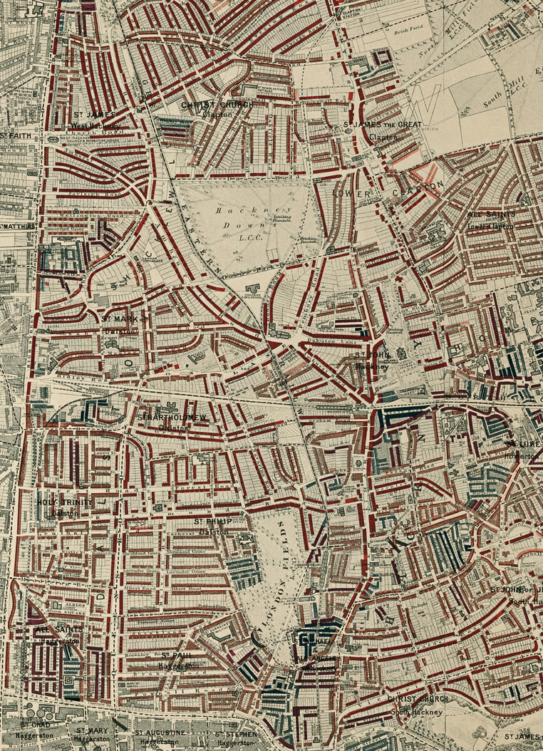
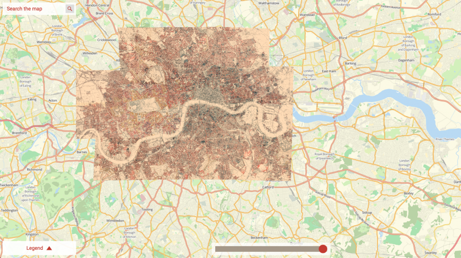
None of the study’s particular limitations take away from the graphic achievements of its maps and explanatory charts. They are, the London School of Economics writes, a striking “early example of social cartography.” The LSE hosts an incredibly detailed, searchable, high-resolution interactive version of the maps, assembled together and overlaid on a modern GPS map of London. They also detail the various editions of the maps as they appeared between 1898 and 1903.
Hand-colored and based on the 1869 Ordnance Survey, the maps seemed “sufficiently important” to Booth to warrant “comprehensive revision.” Here, the police appear in person to guide the process. “Social investigators accompanied policemen on their beats across London,” the LSE writes, “and recorded their own impressions of each street and the comments of the policemen.” You can read the police notebooks from these surveys at the LSE and learn more about the 12 district maps and the demographic data they represent at Mapping London. The LSE printed a hardcover print edition of Booth's work in 2019, complete with 500 illustrations. You can purchase a copy here. Or visit the interactive edition here.
Related Content:
Animations Visualize the Evolution of London and New York: From Their Creation to the Present Day
Synchronized, Timelapse Video Shows Train Traveling from London to Brighton in 1953, 1983 & 2013
Josh Jones is a writer and musician based in Durham, NC. Follow him at @jdmagness
Hand-Colored Maps of Wealth & Poverty in Victorian London: Explore a New Interactive Edition of Charles Booth’s Historic Work of Social Cartography (1889) is a post from: Open Culture. Follow us on Facebook, Twitter, and Google Plus, or get our Daily Email. And don't miss our big collections of Free Online Courses, Free Online Movies, Free eBooks, Free Audio Books, Free Foreign Language Lessons, and MOOCs.


from Open Culture https://ift.tt/2GiDvVK
via Ilumina
Comments
Post a Comment