Human beings got along perfectly well for hundreds of millennia without standardized taxonomies of color, but they didn’t do so in a globally connected culture full of logos, brands, and 24/7 screens. It’s arguable whether the world as we now see it would have been possible without monopolistic color systems like Pantone. They may circumscribe the visual world and dictate color from above. But they also enable international design principles and visual languages that translate easily everywhere.
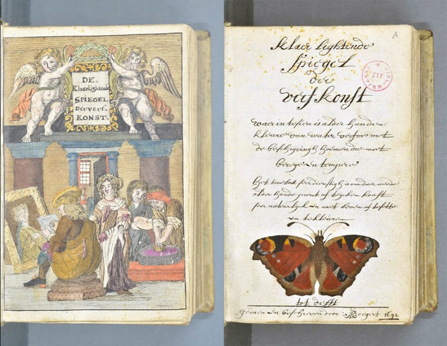
These circumstances did not yet exist in 1692, when Dutch artist A. Boogert created a huge, almost 900-page book on color, Traité des couleurs servant à la peinture à l'eau. But it was slowly coming into being, thanks to studies by philosopher-scientists like Isaac Newton.
Boogert’s book took enlightenment work on optics in a more rigorous design direction than any of his contemporaries, anticipating a number of influential books on color to come in the following centuries, such as the art history-making studies by Johann Wolfgang von Goethe and a book on color used by Charles Darwin during his Beagle voyage.

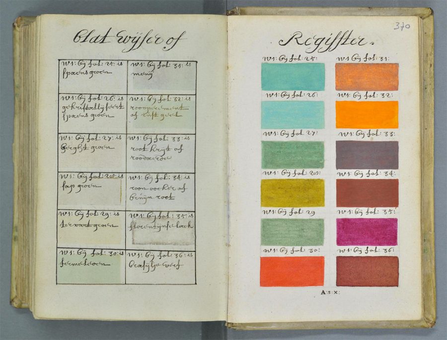
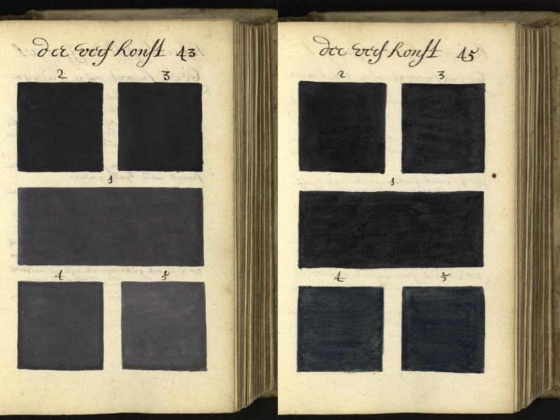
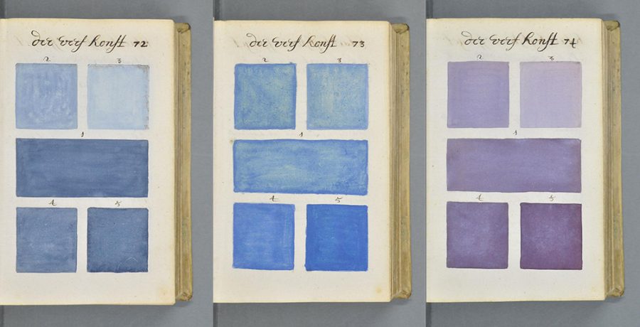
Boogert’s exhaustive study includes handwritten notes and descriptions and hundreds of hand-painted color swatches. This above-and-beyond effort was not, however, made for scientific or industrial purposes but as a guide for artists, showing how to mix watercolors to make every color in the spectrum. The author even includes a comprehensive unit on whites, grays, and blacks. How much historical influence did Boogert’s text have on the development of standardized color systems, we might wonder? Hardly any at all. Its single copy, notes This is Colossal, “was probably seen by very few eyes.”

The obscure book disappeared in the archives of the Bibliothèque Méjanes in Aix-en-Proence, France. That is until its discovery recently by Medieval book historian Erik Kwakkel, who posted scans on his Tumblr and translated some of the introduction from the original Dutch. Since then, the complete text has come online: 898 pages of high-resolution digital scans at the Bibliothèque Méjanes site. (Go to this page, click on the picture, then click on the arrows in the lower right side of the page to move through the book.)
If you read Dutch, all the better to appreciate this rare historic artifact. But you don’t need to understand any of A. Boogert’s explanations on watercolor technique to be staggered by the incredible amount of work that went into this early, overlooked labor of love for systematic approaches to color. Enter the full text here.

Related Content:
The Vibrant Color Wheels Designed by Goethe, Newton & Other Theorists of Color (1665-1810)
Goethe’s Theory of Colors: The 1810 Treatise That Inspired Kandinsky & Early Abstract Painting
Werner’s Nomenclature of Colour, the 19th-Century “Color Dictionary” Used by Charles Darwin (1814)
Josh Jones is a writer and musician based in Durham, NC. Follow him at @jdmagness
A 900-Page Pre-Pantone Guide to Color from 1692: A Complete Digital Scan is a post from: Open Culture. Follow us on Facebook, Twitter, and Google Plus, or get our Daily Email. And don't miss our big collections of Free Online Courses, Free Online Movies, Free eBooks, Free Audio Books, Free Foreign Language Lessons, and MOOCs.
from Open Culture https://ift.tt/2mEWvVe
via Ilumina
Comments
Post a Comment