
A 900-Page Pre-Pantone Guide to Color from 1692: A Complete High-Resolution Digital Scan

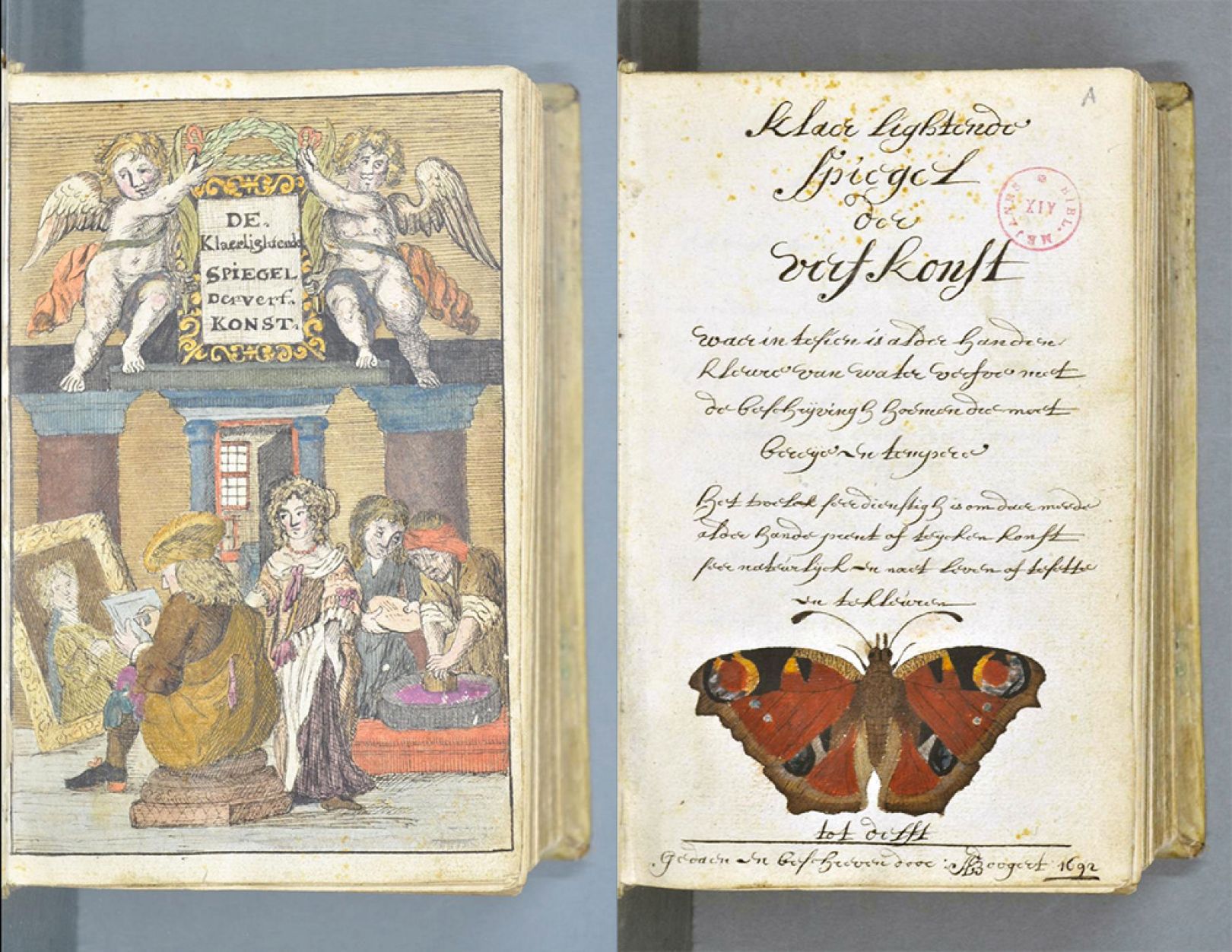
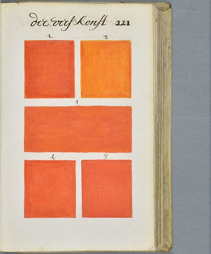
There’s ahead of its time, then there’s Traité des couleurs servant à la peinture à l’eau — or, in its original Dutch title, Klaer Lightende Spiegel der Verfkonst, a 900-page book of paint colors made before any such things were common tools of the artist’s, scientist’s, and industrial designer’s trade. Author and artist A. Boogert created one, and only one, copy of his extraordinary manual on color mixing in 1692. Appearing on the threshold of modern color theory, and featuring over 700 pages of color swatches, the book draws on Aristotle’s system of color rather than the new understanding of the color spectrum, fully elaborated by Newton in his Opticks over a decade later.

It would be another hundred years before a flood tide of color books began to make the theory more practical: from Goethe’s 1810 Theory of Colors and Werner’s 1814 Nomenclature of Colour to the dream of color standardization realized: the Pantone company, launched in 1963.

But if A. Boogert had much influence on the theory or practical application of color in his day, there doesn’t seem to be much evidence for it. Of course most of the Dutch masters had died when the book was completed, and it seems unlikely that those still working in 1692 would have been familiar with its single copy.

Instead, the book was meant to educate watercolorists, hence its French title, which refers to “water-based paint.” (A literal translation of the Dutch runs something like “clearly lighting mirror of the painting art.”) Medieval historian Erik Kwakkel found the book in a French database, “and it turns out to be quite special,” he writes, “because it provides an unusual peek into the workshop of 17th-century painters and illustrators.

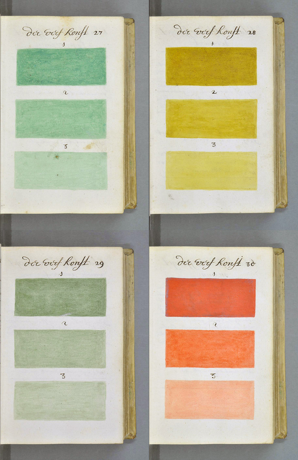
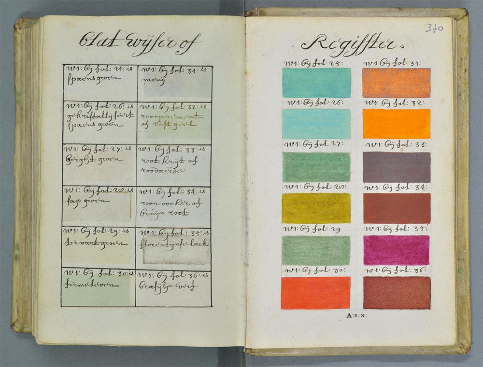
In over 700 pages of handwritten Dutch, the author, who identifies himself as A. Boogert, describes how to make watercolour paints. He explains how to mix the colours and how to change their tone by adding ‘one, two or three portions of water.’… In the 17th Century, an age known as the Golden Age of Dutch Painting, this manual would have hit the right spot.”

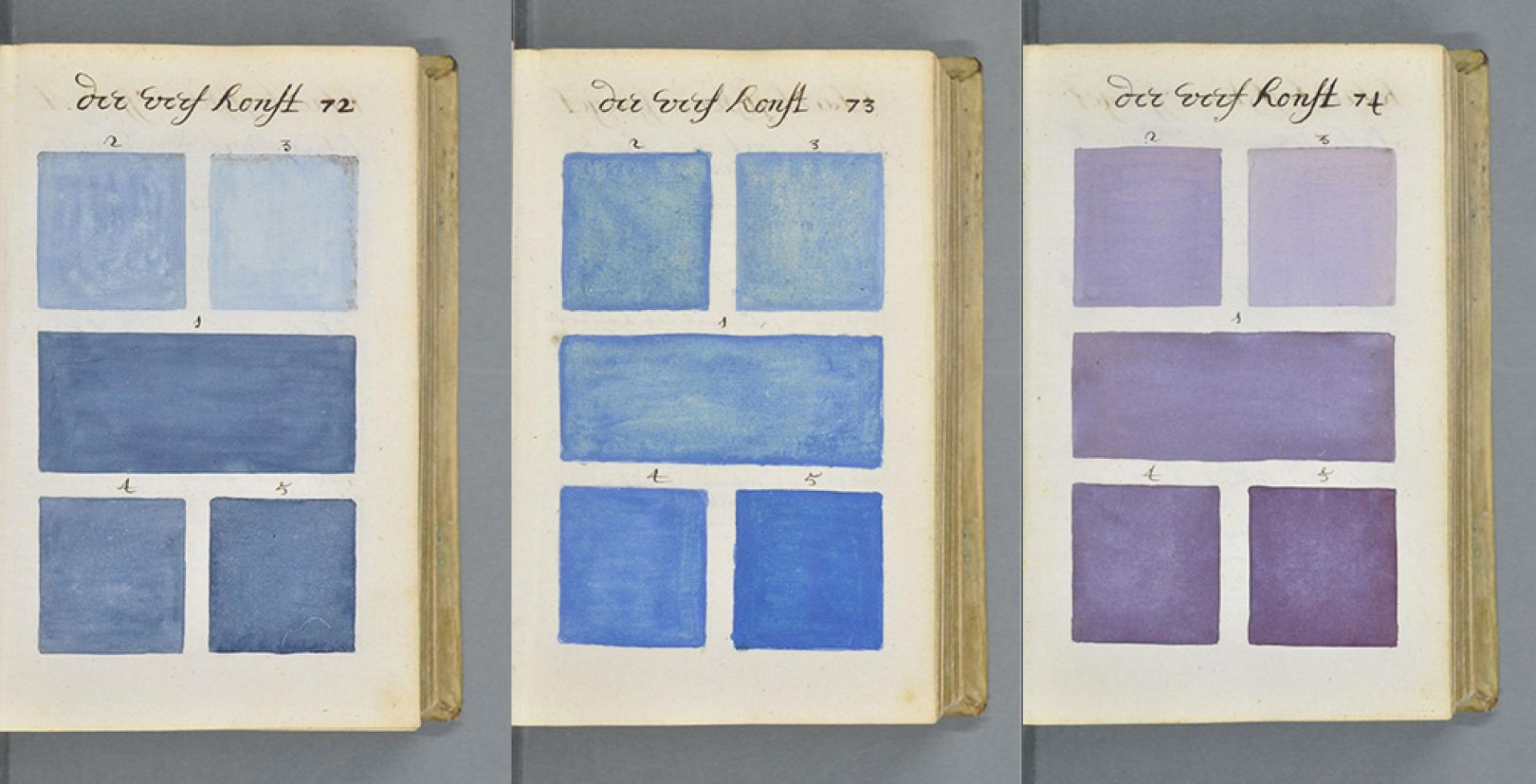
The book is currently housed at Bibliothèque Méjanes in Aix-en-Provence, where you’ll find full-page, zoomable, hi-resolution scans. “Beyond being informational, the images from the book are stunning and addictive flip through,” notes Refinery29. “They resemble page after page of Pantone color chips, except without the household name.” One wonders if “A. Boogert” would have become a household name had his book been printed and distributed. But his color system was already passing away in the Newtonian age of color spectrums and wheels, until paint chips finally came back in style. Visit the color manual online here.

Related Content: 

Goethe’s Colorful & Abstract Illustrations for His 1810 Treatise, Theory of Colors: Scans of the First Edition

Werner’s Nomenclature of Colour, the 19th-Century “Color Dictionary” Used by Charles Darwin (1814)

The Vibrant Color Wheels Designed by Goethe, Newton & Other Theorists of Color (1665-1810)

Josh Jones is a writer and musician based in Durham, NC. Follow him at @jdmagness

A 900-Page Pre-Pantone Guide to Color from 1692: A Complete High-Resolution Digital Scan is a post from: Open Culture. Follow us on Facebook, Twitter, and Google Plus, or get our Daily Email. And don't miss our big collections of Free Online Courses, Free Online Movies, Free eBooksFree Audio Books, Free Foreign Language Lessons, and MOOCs.


from Open Culture https://ift.tt/3rNNx3q
via Ilumina

Comments

Popular posts from this blog

Ishkur’s Guide to Electronic Music: An Interactive, Encyclopedic Data Visualization of 120 Years of Electronic Music

In a very short span of time, the descriptor “electronic music” has come to sound as overly broad as “classical.” But where what we (often incorrectly) call classical developed over hundreds of years, electronic music proliferated into hundreds of fractal forms in only decades. A far steeper quality curve may have to do with the ease of its creation, but it’s also a factor of this accelerated evolution. Music made by machines has transformed since its early 20th-century beginnings from obscure avant-garde experiments to massively popular genres of global dance and pop. This proliferation, notes Ishkur—designer of Ishkur’s Guide to Electronic Music —hasn't always been to the good. Take what he calls “trendwhoring,” a phenomenon that spawns dozens of new works and subgenera in short order, though it’s arguable whether many of them should exist. Ishkur, describes this process below in an excerpt from his erudite, sardonic “Frequently Unasked Questions”: If fart noises were sudde...

Board Game Ideology — Pretty Much Pop: A Culture Podcast #108

https://podtrac.com/pts/redirect.mp3/traffic.libsyn.com/secure/partiallyexaminedlife/PMP_108_10-7-21.mp3 As board games are becoming increasingly popular with adults, we ask: What’s the relationship between a board game’s mechanics and its narrative? Does the “message” of a board game matter? Your host Mark Linsenmayer is joined by game designer Tommy Maranges , educator Michelle Parrinello-Cason , and ex-philosopher Al Baker to talk about re-skinning games, designing player experiences, play styles, game complexity, and more. Some of the games we mention include Puerto Rico, Monopoly, Settlers of Catan, Sorry, Munchkin, Sushi Go, Welcome To…, Codenames, Pandemic, Occam Horror, Terra Mystica, chess, Ticket to Ride, Splendor, Photosynthesis, Spirit Island, Escape from the Dark Castle, and Wingspan. Some articles that fed our discussion included: “ The Board Games That Ask You to Reenact Colonialism ” by Luke Winkie “ Board Games Are Getting Really, Really Popular ” by Darron Cu...

A 10 Billion Pixel Scan of Vermeer’s Masterpiece Girl with a Pearl Earring: Explore It Online

We admire Johannes Vermeer’s  Girl with a Pearl Earring   for many reasons , not least that it looks exactly like a girl with a pearl earring. Or at least it does from a distance, as the master of light himself no doubt stepped back to confirm countless times during the painting process, at any moment of which he would have been more concerned with the brushstrokes constituting only a small part of the image. But even Vermeer himself could have perceived only so much detail of the painting that would become his masterpiece. https://www.youtube.com/watch?v=cKaZYTwmjwU Now, more than 350 years after its completion, we can get a closer view of Girl with a Pearl Earring  than anyone has before through a newly released  10 billion-pixel panorama . At this resolution, writes Petapixel’s Jason Schneider , we can “see the painting down to the level of 4.4-microns per pixel.” Undertaken by Emilien Leonhardt and Vincent Sabatier of 3D microscope maker Hirox Europe ...