
A Subway Map of Human Anatomy: All the Systems of Our Body Visualized in the Style of the London Underground
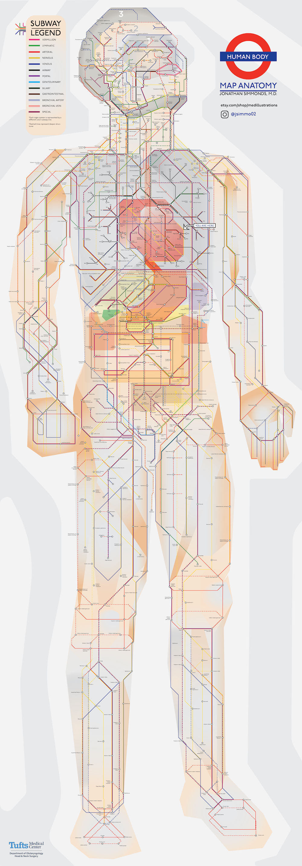
We all have bodies, but how many of us truly know our way around them? Plenty of books explain in detail the functions of and relationships between each and every part of our anatomy, but few of them do it in a way the layman — and especially the layman not yet accustomed to the sight of human viscera laid bare — can readily grasp. We need a visualization of the human body, but what kind of visualization can best represent it with a maximum of clarity and a minimum of misleading distortion?

"Most people might imagine an intricate network of blood vessels or the complex neural circuits of the brain," writes Visual Capitalist's Iman Ghosh. "Or we might picture diagrams from the iconic medical textbook, Gray’s Anatomy." But how about a visualization of the body in the style of a classic piece of information design we've all seen at least once, the London Underground map? "Created by Jonathan Simmonds M.D., a resident physician at Tufts Medical Center," Ghosh writes, "it’s a simple yet beautifully intuitive demonstration of how efficiently our bodies work."

Just as Harry Beck's original 1933 London Underground map straightened out and color-coded each of the lines then in operation, Simmonds' anatomical map traces thirteen different "lines" through the body, each of which represents a different system of the body: the nervous system in yellow, for example, the airway system in black, and the lymphatic system in green. "While dashed lines represent deeper structures, sections with ‘transfers’ show where different organ systems intersect," Ghosh writes. If you're wondering where to start, she adds, "there’s a helpful 'You Are Here' at the heart."

You can take a close look at Simmonds' work in a large, high-resolution version here. Not only does following the model of the London Underground map introduce a degree of immediate legibility seldom seen (at least by non-medical students) in anatomical diagrams, it also underscores an aspect of the very nature of our human bodies that we don't often consider. We might instinctively think of them as sets of discrete organs all encased together and functioning independently, but in fact they're more like cities: just as busy, just as interconnected, just as dependent on connections and routines, and just as improbably functional.

via Visual Capitalist

Related Content:

Download the Sublime Anatomy Drawings of Leonardo da Vinci: Available Online, or in a Great iPad App

Mapping Emotions in the Body: A Finnish Neuroscience Study Reveals Where We Feel Emotions in Our Bodies

The Roman Roads of Britain Visualized as a Subway Map

The Genius of Harry Beck’s 1933 London Tube Map–and How It Revolutionized Subway Map Design Everywhere

A Wonderful Archive of Historic Transit Maps: Expressive Art Meets Precise Graphic Design

Based in Seoul, Colin Marshall writes and broadcasts on cities, language, and culture. His projects include the book The Stateless City: a Walk through 21st-Century Los Angeles and the video series The City in Cinema. Follow him on Twitter at @colinmarshall, on Facebook, or on Instagram.

A Subway Map of Human Anatomy: All the Systems of Our Body Visualized in the Style of the London Underground is a post from: Open Culture. Follow us on Facebook, Twitter, and Google Plus, or get our Daily Email. And don't miss our big collections of Free Online Courses, Free Online Movies, Free eBooks, Free Audio Books, Free Foreign Language Lessons, and MOOCs.


from Open Culture http://bit.ly/2R9rjrM
via Ilumina

Comments

Popular posts from this blog

What Voltaire Meant When He Said That “We Must Cultivate Our Garden”: An Animated Introduction

“Voltaire’s goal in writing [his 1759 satire Candide ] was to destroy the optimism of his times,” says Alain de Botton in the School of Life video above, “an optimism that centered around science, love, technical progress, and a faith in reason.” These beliefs were folly, Voltaire thought: the transfer of faith from a providential God to a perfect, clockwork universe. Candide satirizes this happy rationalism in Doctor Pangloss, whose belief that ours is the best of possible worlds comes directly from the philosophical optimism of Gottfried Leibniz . The preponderance of the evidence, Voltaire made abundantly clear in the novel’s series of increasingly horrific episodes, points toward a blind, indifferent universe full of needless cruelty and chaos. “Hope was, he felt, a disease,” de Botton says, and “it was Voltaire’s generous goal to try and cure us of it.” But as everyone who has read Candide (or read a summary or brief notes on Candide ) knows, the novel does not end with ...

When Albert Einstein & Charlie Chaplin Met and Became Fast Famous Friends (1930)

Photo via Wikimedia Commons “You do not really understand something unless you can explain it to your grandmother,” goes a well-known quote attributed variously to Albert Einstein, Richard Feynman, and Ernest Rutherford. No matter who said it, “the sentiment… rings true,” writes Michelle Lavery , “for researchers in all disciplines from particle physics to ecopsychology.” As Feynman discovered during his many years of teaching , it could be “the motto of all professional communicators,” The Guardian ’s Russell Grossman writes , “and especially those who earn a living communicating the tricky business of science.” Einstein became one of the world’s great science communicators by choice, not necessity, and found ways to explain his complex theories to children and the elderly alike. But perhaps, if he’d had his way, he would rather have avoided words altogether, and preferred acrobatic feats of silent daring to get his message across. We might at least conclude so from his reverence f...

An Interactive Map of Odysseus’ 10-Year Journey in Homer’s Odyssey

The Odyssey , one of Homer's two great epics, narrates Odysseus' long, strange trip home after the Trojan war . During their ten-year journey, Odysseus and his men had to overcome divine and natural forces, from battering storms and winds to difficult encounters with the Cyclops Polyphemus, the cannibalistic Laestrygones, the witch-goddess Circe and the rest. And they took a most circuitous route, bouncing all over the Mediterranean, moving first down to Crete and Tunisia. Next over to Sicily, then off toward Spain, and back to Greece again. If you're looking for an easy way to visualize all of the twists and turns in  The Odyssey , then we'd recommend spending some time with the  interactive map created by Gisèle Mounzer .  "Odysseus' Journey"  breaks down Odysseus' voyage into 14 key scenes and locates them on a modern map designed by Esri, a company that creates GIS mapping software. Meanwhile, if you're interested in the whole concept of ...