Among typography enthusiasts, all non-contrarians love Helvetica. Some, like filmmaker Gary Hustwit and New York subway map creator Massimo Vignelli, even made a documentary about it. Created by Swiss graphic designer Max Miedinger with Haas Type Foundry president Eduard Hoffmann and first introduced in 1957, Helvetica still stands as a visual definition of not just modernism but modernity itself. That owes in part to its clean, unambiguous lines, and also to its use of space: as all the aforementioned typography enthusiasts will have noticed, Helvetica leaves little room between its letters, which imbues text written in the font with a certain solidity. No wonder it so often appears, more than half a century after its debut, on the signage of public institutions as well as on the promotion of products that live or die by the ostensible timelessness of their designs.
But as times change, so must even near-perfect fonts: hence Helvetica Now. "Four years ago, our German office [was] kicking around the idea of creating a new version of Helvetica," Charles Nix, type director at Helvetica-rights-holder Monotype tells The Verge. "They had identified a short laundry list of things that would be better." What shortcomings they found arose from the fact that the font had been designed for an analog age of optical printing, and "when we went digital, a lot of that nuance of optical sizing sort of washed away." Ultimately, the project was less about updating Helvetica than restoring characters lost in its adaptation to digital, including "the straight-legged capital 'R,' single-story lowercase 'a,' lowercase 'u' without a trailing serif, a lowercase 't' without a tailing stroke on the bottom right, a beardless 'g,' some rounded punctuation."
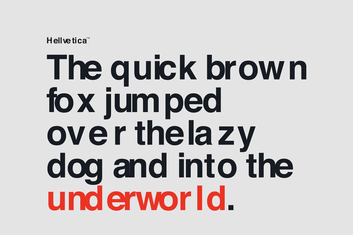
The development of Helvetica Now also necessitated a close look at all the versions of Helvetica so far developed (the most notable major revision being Neue Helvetica, released in 1983) and adapting their best characteristics for an age of screens. Few of those characteristics demanded more attention than the spacing — or to use the typographical term, the kerning. But however astonishing a showcase it may be, Helvetica Now doesn't drive home the importance of the art of kerning in as visceral a manner as another new typeface: Hellvetica, designed by New York creative directors Zack Roif and Matthew Woodward. Much painstaking labor has also gone into Hellvetica's kerning, but not to make it as beautiful as possible: on the contrary, Roif and Woodard have taken Helvetica and kerned it for maximum ugliness.

The Verge's Jon Porter describes Hellvetica as "a self-aware Comic Sans with kerning that’s somehow much much worse." If that most hated Windows font hasn't been enough to inflict psychological disturbance on the designers in your life, you can head to Hellvetica's official site and "experience it in all its uneven, gappy glory." Roif and Woodard have made Hellvetica free to use, something that certainly can't be said of any genuine version of Helvetica. In fact, the sheer cost of licensing that most modern of all fonts has, in recent years, pushed even the formerly Helvetica-using likes of Apple, Google, and IBM to come up with their own typefaces instead — all of which, tellingly, resemble Helvetica. We can consider them all weapons in the life of a designer, which, as Vignelli put it, "is a life of fight. Fight against the ugliness." Happy downloading...
Related Content:
The History of Typography Told in Five Animated Minutes
Designer Massimo Vignelli Revisits and Defends His Iconic 1972 New York City Subway Map
Van Gogh’s Ugliest Masterpiece: A Break Down of His Late, Great Painting, The Night Café (1888)
Based in Seoul, Colin Marshall writes and broadcasts on cities, language, and culture. His projects include the book The Stateless City: a Walk through 21st-Century Los Angeles and the video series The City in Cinema. Follow him on Twitter at @colinmarshall or on Facebook.
Download Hellvetica, a Font that Makes the Elegant Spacing of Helvetica Look as Ugly as Possible is a post from: Open Culture. Follow us on Facebook, Twitter, and Google Plus, or get our Daily Email. And don't miss our big collections of Free Online Courses, Free Online Movies, Free eBooks, Free Audio Books, Free Foreign Language Lessons, and MOOCs.


from Open Culture https://ift.tt/2rOEyG1
via Ilumina
Comments
Post a Comment