Emma Willard, the First Woman Mapmaker in America, Creates Pioneering Maps of Time to Teach Students about Democracy (Circa 1851)
We all know Marshall McLuhan’s pithy, endlessly quotable line “the medium is the message,” but rarely do we stop to ask which one comes first. The development of communication technologies may genuinely present us with a chicken or egg scenario. After all, only a culture that already prized visual stimuli but undervalued physical movement would have invented and adopted the television.
In Society of the Spectacle, Guy Debord ties the tendency toward passive visual consumption to “commodity fetishism, the domination of society by ‘intangible as well as tangible things,’ which reaches its absolute fulfillment in the spectacle, where the tangible world is replaced by a selection of images which exist above it, and which simultaneously impose themselves as the tangible par excellence.” It seems an apt description of a screen-addicted culture.
What can we say, then, of a culture addicted to charts and graphs? Earliest examples of the form were often more elaborate than we're used to seeing, hand-drawn with care and attention. They were also not coy about their ambitions: to condense the vast dimensions of space and time into a two-dimensional, color-coded format. To tidily sum up all human and natural history in easy-to-read visual metaphors.
This was as much a religious project as it was a philosophical, scientific, political, and pedagogical one. The domains are hopelessly entwined in 18th and 19th century. We should not be surprised to see freely mingle the earliest infographics. The creators of such images were polymaths, and deeply devout. Joseph Priestly, English chemist, philosopher, theologian, political theorist and grammarian, made several visual chronologies representing “the lives of two thousand men between 1200 BC and 1750 AD” (conveying a clear message about the sole importance of men).
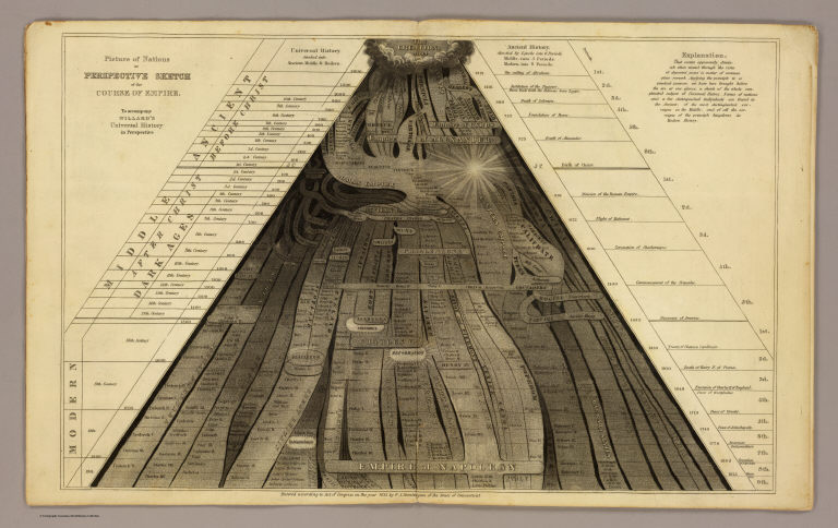
“After Priestly,” writes the Public Domain Review, “timelines flourished, but they generally lacked any sense of the dimensionality of time, representing the past as a uniform march from left to right.” Emma Willard, “one of the century’s most influential educators” set out to update the technology, “to invest chronology with a sense of perspective.” In her 1836 Picture of Nations; or Perspective Sketch of the Course of Empire, above (view and download high resolution images here), she presents “the biblical Creation as the apex of a triangle that then flowed forward in time and space toward the viewer.”
The perspective is also a forced point of view about origins and history. But that was exactly the point: these are didactic tools meant for textbooks and classrooms. Willard, “America’s first professional female mapmaker,” writes Maria Popova, was also a “pioneering educator,” who founded “the first women’s higher education institution in the United States when she was still in her thirties…. In her early forties, she set about composing and publishing a series of history textbooks that raised the standards and sensibilities of scholarship.”
Willard recognized that linear graphs of time did not accurately do justice to a three-dimensional experience of the world. Humans are “embodied creatures who yearn to locate themselves in space and time.” The illusion of space and time on the flat page was an essential feature of Willard’s underlying purpose: “laying out the ground-plan of the intellect, so far as the whole range of history is concerned.” A proper understanding of a Great Man (and at least one Great Woman, Hypatia) version of history—easily condensed, since there were only around 6,000 years from the creation of the universe—would create “enlightened and judicious supporters” of democracy.
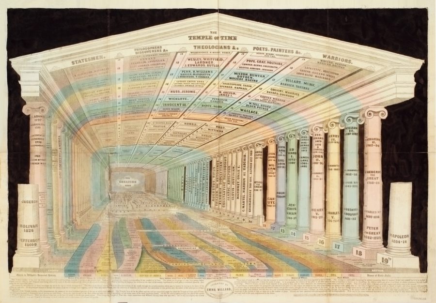
History is represented literally as a sacred space in Willard’s 1846 Temple of Time, its providential beginnings formally balanced in equal proportion to its every monumental stage. Willard’s intent was expressly patriotic, her trappings self-conscious classical. Her maps of time were ways of situating the nation as a natural successor to the empires of old, which flowed from the divine act of creation. They show a progressive widening of the world.
“Half a century before W.E.B. Du Bois… created his modernist data visualizations for the 1900 World’s Fair,” Popova writes, The Temple of Time “won a medal at the 1851 World’s Fair in London.” Willard accompanied the infographic with a statement of intent, articulating a media theory, over a hundred years before McLuhan, that sounds strangely anticipatory of his famous dictum.
The poetic idea of “the vista of departed years” is made an object of sight; and when the eye is the medium, the picture will, by frequent inspection, be formed within, and forever remain, wrought into the living texture of the mind.
Learn more about Emma Willard’s infographic revolution at the Public Domain Review and Brain Pickings.
Related Content:
Download 91,000 Historic Maps from the Massive David Rumsey Map Collection
Josh Jones is a writer and musician based in Durham, NC. Follow him at @jdmagness
Emma Willard, the First Woman Mapmaker in America, Creates Pioneering Maps of Time to Teach Students about Democracy (Circa 1851) is a post from: Open Culture. Follow us on Facebook, Twitter, and Google Plus, or get our Daily Email. And don't miss our big collections of Free Online Courses, Free Online Movies, Free eBooks, Free Audio Books, Free Foreign Language Lessons, and MOOCs.


from Open Culture https://ift.tt/3iYvmon
via Ilumina
Comments
Post a Comment